

Introduction: Design in Motion
The New York City Subway is not just a transportation network; it’s an immersive design experience. Every day, millions of commuters encounter one of the most influential and iconic pieces of graphic design in the modern world—the NYC Subway visual identity. From the Helvetica typeface to the unmistakable color-coded lines, the subway’s graphic design is a masterpiece of functionality, clarity, and aesthetic brilliance. This article explores the history, development, impact, and legacy of New York Subway graphic design.
The Origins of the System
Chaos Before Clarity
Before the current unified system emerged, the New York City subway was a confusing mess. Operated by three different companies (IRT, BMT, and IND), each had its own signage and design logic. By the 1960s, riders were bombarded with inconsistent signs, outdated maps, and poor navigation tools, which caused frustration and inefficiency. Something had to change.
The Birth of a Design Revolution
Enter Massimo Vignelli and Unimark International
In 1966, the New York City Transit Authority (NYCT) took a pivotal step: they hired Unimark International, co-founded by Italian modernist designer Massimo Vignelli. Alongside Bob Noorda, Vignelli brought a modernist European design philosophy to the chaos of the NYC subway.
Their task was daunting—create a wayfinding system that could simplify one of the world’s most complex urban transport systems. The goal was clarity, legibility, and consistency.
Helvetica: The Typeface That Guides Millions
Why Helvetica?
One of the most radical changes was the adoption of Helvetica, a typeface designed in Switzerland in 1957. Known for its clean lines, geometric shapes, and extreme legibility, Helvetica became the backbone of subway signage. It replaced the previously used sans-serifs and serifs that varied between stations.
Typography as a Functional Tool
Vignelli believed typography was not just aesthetic—it was a tool for communication. Helvetica’s neutrality and consistency allowed it to deliver critical information clearly, without the interference of personality or ornamentation.
Color Coding the Chaos
Simplicity Through Color
Another brilliant innovation was the introduction of color-coded subway lines. Vignelli’s team gave each line a designated color to assist with immediate recognition. The A-C-E line became blue, 1-2-3 became red, and so on. This made the experience significantly more intuitive for riders.
A Visual Language for Navigation
Icons, numbers, arrows, and spacing were methodically designed. The intention was to create a “grammar” of signs that would be universally understandable regardless of a person’s language or background. It was a design system with its own logic and rules—consistent and accessible.
The 1972 Subway Map: A Controversial Classic
Vignelli’s Abstract Map
Perhaps the most iconic artifact of this era is the 1972 New York Subway graphic design Map designed by Vignelli. Unlike previous maps, it was not geographically accurate. Instead, it emphasized legibility and clarity, using 45- and 90-degree angles, color-coded lines, and clear typography.
Public Reaction
While designers and modernists admired the map’s clarity, everyday riders found it too abstract. For example, Central Park appeared as a square, which confused people expecting a rectangle. The NYC public wanted realism, not minimalism.
By 1979, the MTA replaced it with a more geographically accurate version designed by Michael Hertz Associates. However, Vignelli’s map lives on as a cult favorite and design icon, now even available as posters and apps.
Michael Hertz and the Next Evolution
Merging Art and Usability
After Vignelli’s bold experiment, the baton passed to Michael Hertz Associates. Hertz’s 1979 map brought back geography but retained many of Vignelli’s successful elements—color-coded lines, clean typography, and a grid system. The goal was a compromise between visual beauty and practical use.
The Hertz map lasted well into the 21st century, forming the basis of the maps we see in trains and stations today.
Graphic Design Meets Modern Technology
Digital Screens and Dynamic Signage
With the advent of LED and LCD technology, the subway system is undergoing a graphic design evolution. Dynamic signs now show arrival times, disruptions, and route changes in real-time. The use of digital typefaces mimicking Helvetica ensures consistency even in modern displays.
Subway Apps and Interfaces
Modern apps like Citymapper and Google Maps incorporate subway maps, station signs, and design conventions set by Vignelli and Hertz. The NYC subway’s design DNA has migrated from physical spaces to the digital world—helping millions plan their routes with visual consistency.
Art in the Stations: Beyond Wayfinding
MTA Arts & Design Program
Launched in 1985, the MTA Arts & Design program commissioned artists to enhance stations with murals, mosaics, and sculptures. These works integrate beautifully with the subway’s utilitarian graphic design, adding warmth, cultural depth, and emotional resonance to public space.
Subway Posters and Visual Campaigns
Posters in subway cars—whether they’re ads, poetry series, or PSAs—follow design guidelines that reflect the system’s heritage. Typography, layout, and color choices often reflect a respect for the subway’s design legacy.
Iconography and Pictograms
Universal Language
The New York Subway graphic design pictograms—such as accessibility icons, escalator signs, and restroom indicators—are part of a unified design system. Many were influenced by international design standards like AIGA’s transportation symbols or the ISO symbol sets, but adapted to NYC’s unique context.
Signal Strip Maps
Those small strip maps on train doors that light up the next stop? They’re another layer of clever visual design—using light, icons, and minimal text to inform without overwhelming. They represent the next generation of UI in physical space.
Design for the Future: Challenges and Opportunities
Accessibility and Inclusive Design
Although visually iconic, the system still faces criticism for not being fully accessible. Future design upgrades aim to include Braille, audio signage, color-blind-friendly graphics, and better placement for navigation aids.
Responsive, Modular Design Systems
Today’s designers working with the MTA are leaning into modular design systems—graphics that can evolve and adapt to new stations, reroutes, or branding changes without overhauling the entire system.
Global Influence of NYC Subway Design
A Model for Urban Transit Design
Cities like London, Tokyo, and Paris have long-standing design identities, but the NYC subway remains a favorite case study in urban graphic design courses worldwide. Its legacy has inspired transit systems in Toronto, Berlin, and even Seoul, which adopted similar typefaces and mapping logic.
Pop Culture and Design Crossovers
The subway’s signage and Helvetica-based graphics have made appearances in music videos, fashion campaigns, films, and art exhibits. You’ll find NYC subway-inspired design on t-shirts, tote bags, and even in modern web UI design principles.
Helvetica vs. Standard: The Typeface Debate
Interestingly, despite Helvetica’s legacy, the current MTA standard is not technically Helvetica—it’s Helvetica Neue and Standard Medium, depending on the signage. The difference is subtle to most commuters, but it has sparked debates in the design world about authenticity and consistency.
Some purists still advocate a return to the original Helvetica-only signage, citing visual clarity. Others push for bespoke typefaces developed specifically for digital displays.
The Legacy of Massimo Vignelli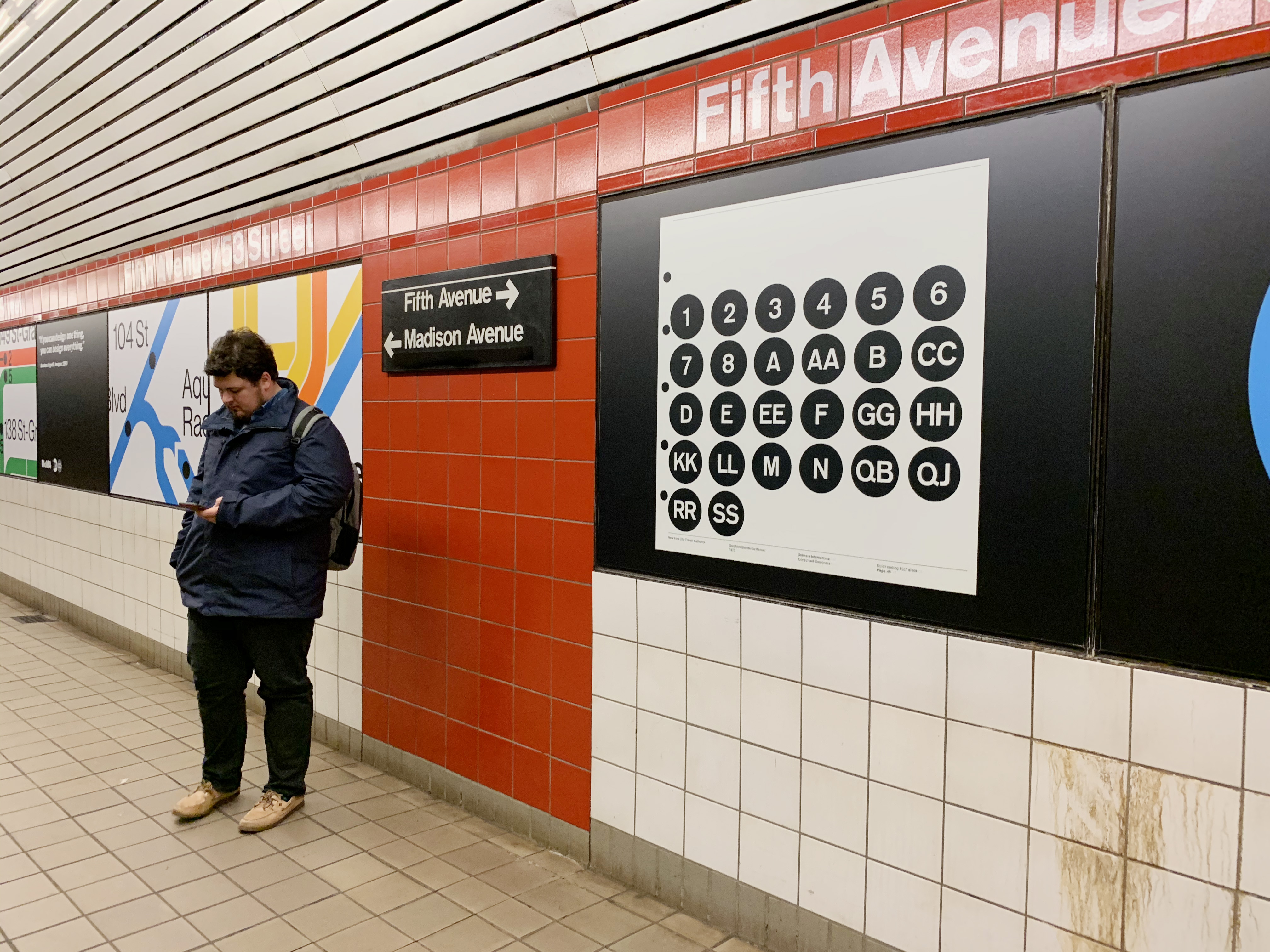
A Vision that Outlived Criticism
Massimo Vignelli once said, “If you can design one thing, you can design everything.” His work for the subway is a testament to that philosophy. What began as a controversial modernist vision has become a timeless icon of order, clarity, and bold design thinking.
Today, the Vignelli map is on display at MoMA, and designers revere it as a daring re-imagining of public space design. It proved that graphic design could solve real-world problems—not just decorate, but inform, guide, and enhance.
Conclusion: The Beauty of Functional Design
The New York Subway graphic design system is more than just a visual identity—it’s a public service. It helps people move through one of the busiest cities in the world with clarity and confidence. It sets a standard for how design can blend form and function, legacy and innovation.
From Vignelli’s avant-garde vision to modern modular systems, the NYC subway continues to evolve while honoring its design heritage. It’s a masterclass in branding without logos, a visual system that transcends languages, and a reminder that great design is invisible—it just works.
Whether you’re a tourist or a daily commuter, chances are the design of the New York City subway has shaped your experience without you even realizing it. And that, perhaps, is the highest compliment a designer could ever receive.


